...
Table of Contents
...
| borderColor | green |
|---|---|
| borderWidth | 1 |
| titleBGColor | #ddffcc |
| borderStyle | solid |
| title | Definition |
Introduction
The CheckBox
...
is one of the generic HTML Form input elements.
In the Form Builder, one is able to define the options available to the Select Box via various means, including
...
the use of Options Binder.
Get Started
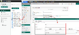
The easiest way to see how the CheckBoxes works are to use the existing built-in App Expenses Claims. Here are the steps:
| Steps | Screens (Click to view) | ||||||
|---|---|---|---|---|---|---|---|
|
Figure 1 Figure 2 |
Figure 1: Sample Check Box CheckBox in Form Builder
Figure 2: Check Box
CheckBox Properties
Edit CheckBox
| Name | Description | Screen (Click to view) | |
| ID | Element ID (By declaring as "type", a corresponding database table column "c_type" will be created) | ||
| Label | Element Label to be displayed to end user. | ||
| Options (Hardcoded) | Select Box options
| ||
| Or Choose Options Binder | Options to be populated dynamically using Options Binder plugin. |
...
Advanced Options
Data
| Name | Description | Screens (Click to view) | |||||||
|---|---|---|---|---|---|---|---|---|---|
| Default Value | Default Value when there's no existing value found/selected. A Hash Variable is accepted here. For example, you may key the following
to pre-populate the field with currently logged in user's name. You may define multiple default options by separating them using semicolons.
| ||||||||
| Validator | Attach a Validator plugin to validate the input value.
|
Dependency
| Name | Description | Screens (Click to view) |
|---|---|---|
| Field ID to control available options based on Grouping | Dynamically change the available options based on the "grouping" attribute defined in the options by matching to the current value of the element ID defined. |
UI
| Name | Description | Screens (Click to view) |
|---|---|---|
| Readonly | Determines if the element is editable. | |
| Display field as Label when readonly? | Displays the value of the element as plain text when element is set to "Readonly". |
Workflow
| Name | Description | Screens (Click to view) | |||||||
|---|---|---|---|---|---|---|---|---|---|
| Workflow Variable | If the form is part of a workflow process, upon saving of the form (by clicking on "Save as Draft" or "Complete" button). The value in this input field will be saved into the corresponding workflow variable named here.
|


