Table of Contents
Introduction
| English |
|---|
The |
...
Check Box is one of the generic HTML Form input elements. In the Form Builder, one is able to define the options available to the Select Box via various means, including the use of Options |
...
Data Store. |
Get Started
The easiest way to see how the CheckBoxes the Check Boxes works are to use the existing built-in App Expenses Claims. Here are the steps:
- Start Joget Server and open the App Center.
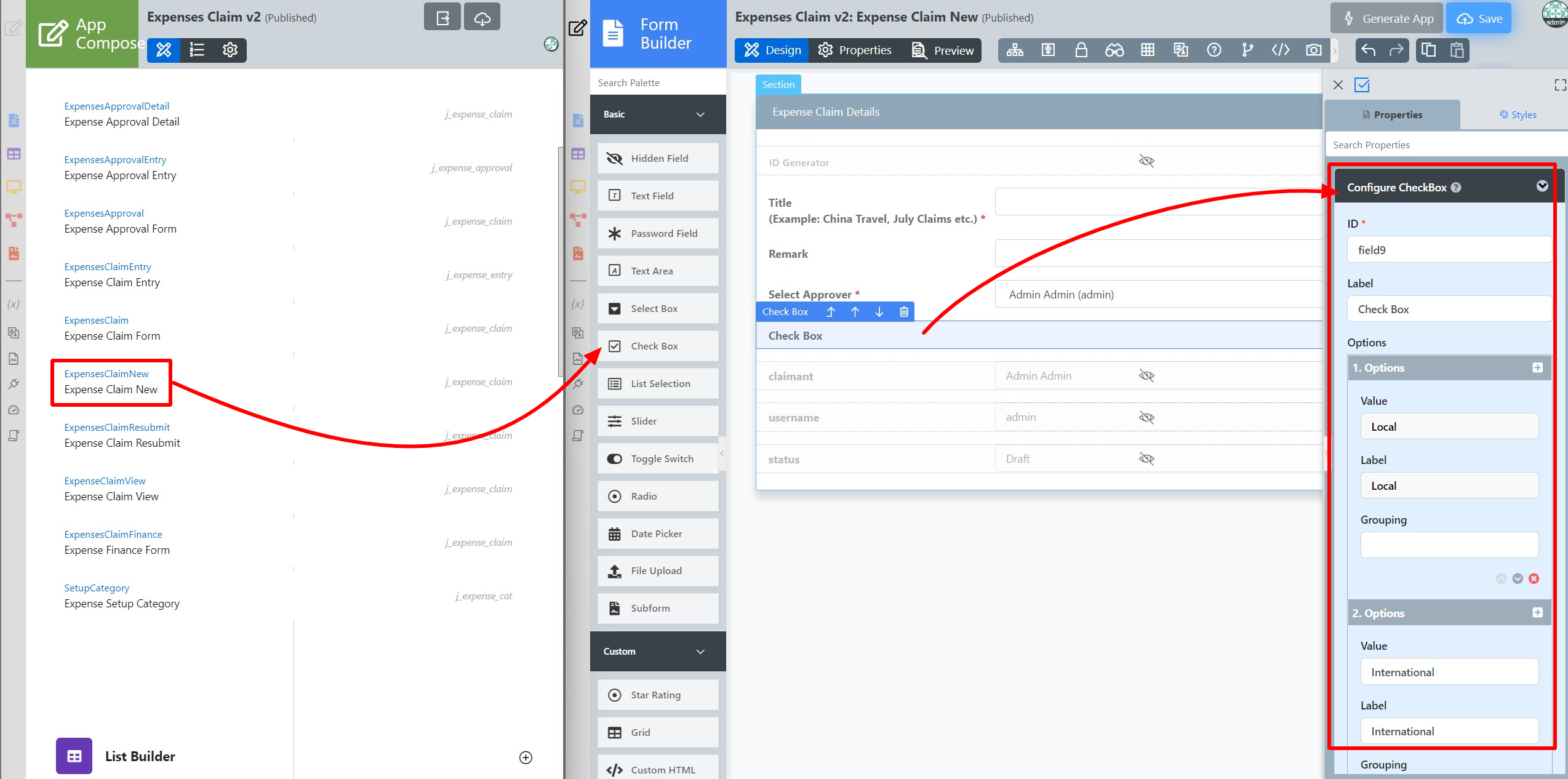
- Log in as admin and click on the pencil icon on the Expenses Claim to open the Design App. (see Figure 1)
Figure 1 - Click on Expense Claim New and you will be directed to the Form Builder.
- Drag and drop a CheckBox Check Box element on to the canvas.
- Click on the CheckBox Check Box element to open up the Configure CheckBox Check Box properties.
- Fill up the Edit CheckBox the Configure Check Box properties as follows and click on OK Apply Change (see Figure 2):
- ID: type
- Label: Type
Options Hardcoded:
Value Label Local Local International International
Figure 2 - Click on Preview to see that it works.
CheckBox Check Box Properties
Edit CheckBox
Configure Check Box
| Name | Description | ||||
| Label | Element Label to be displayed to end-user. | ||||
| ID | Element ID (By declaring as "type", a corresponding database table column "c_type" will be created) Please see Form Element for more information about defining the ID and list of reserved IDs. Label | Element Label to be displayed to end-user. | |||
| Options (Hardcoded) | Select Box options
| Binder
| |||
| Or | Choose Options BinderLoad Data From | Options to be populated dynamically using Options | Binder pluginData Store. |
Advanced Options
Data
| Name | Description | |||||||
|---|---|---|---|---|---|---|---|---|
| Default Value | Default Value when there's no existing value found/selected. A Hash Variable is accepted here. For example, you may key the following
to pre-populate the field with currently logged in user's name. You may define multiple default options by separating them using semicolons.
| |||||||
| Validator | Attach a Validator plugin to validate the input value.
|
...


