Table of Contents
Introduction
| English |
|---|
The Popup Select Box is an enhancement of the ordinary SelectBox. Instead of selecting from a generic drop-down list, the Popup Select Box allows you to select from a |
...
List instead. The Popup Select Box is only available |
...
on Professional and Enterprise Edition. |
| Info | ||
|---|---|---|
| ||
If you have thousands of selections to choose from, Popup Select Box is an ideal form element to use as you will be choosing from listing with pagination and search filter, improving loading speed and user experience. |
...
The easiest way to see how the Popup Select Box works are to use the existing built-in App Expenses Claims. Here are the steps:
- Start the Joget Server and open and open the App Center.
- Log in as admin and click on the pencil icon on the Expenses Claim to open the Design App Composer. (see Figure 1)
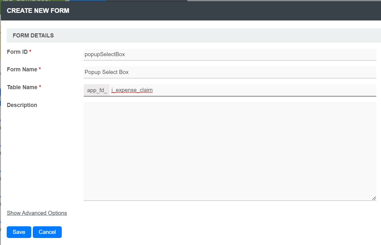
Figure 1 - Click on the Create New Form button and fill up the Form Details as follows (see Figure 2):
- Form ID: popupSelectBox
- Form Name: Popup Select Box
- Table Name: j_expense_claim
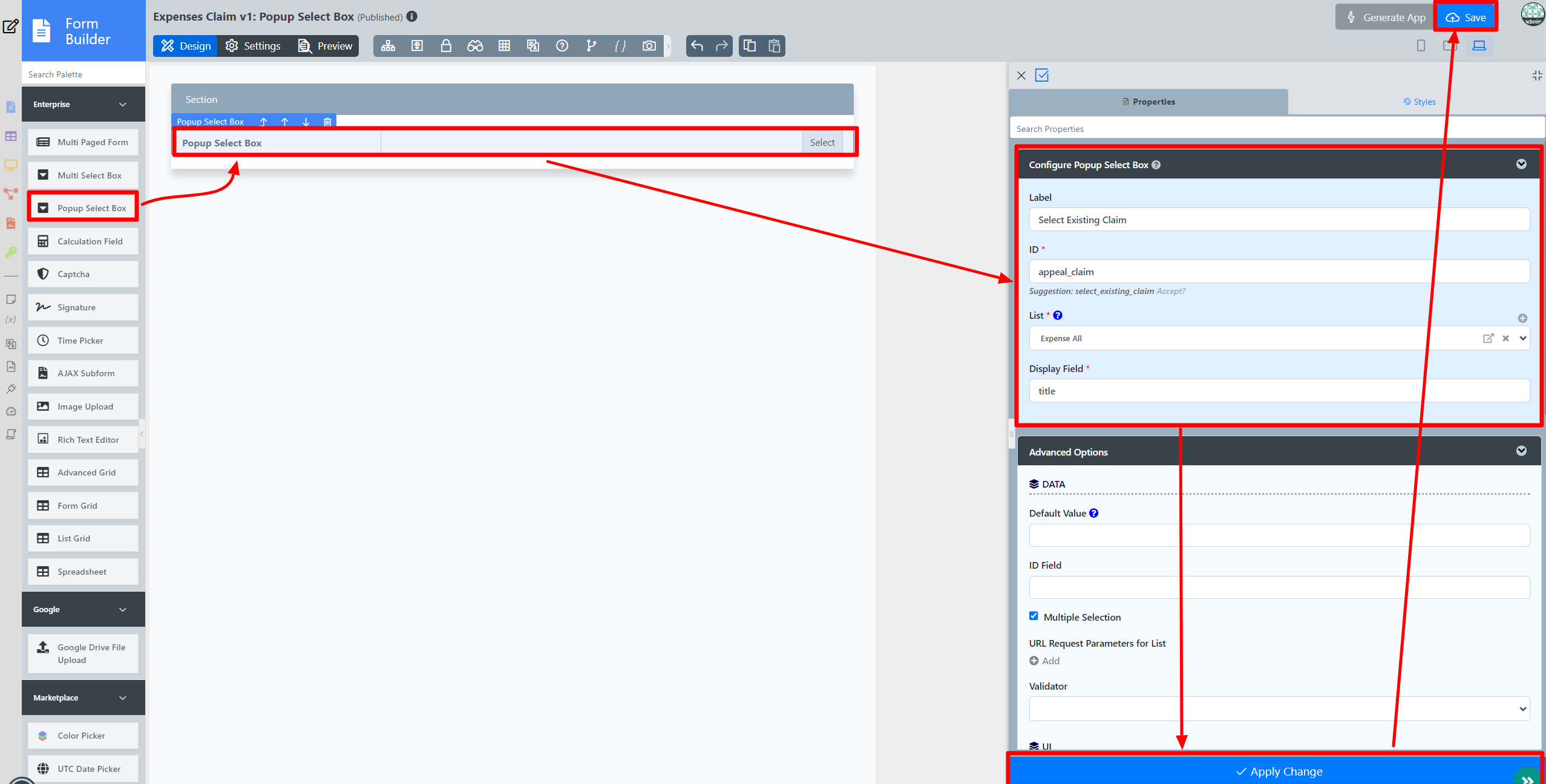
Figure 2 - Drag and drop a Popup Select Box element on to the canvas.
- Click on the Popup Select Box element to open up the Configure Popup Select Box properties.
- Fill up the Edit Popup Select Box properties as follows and click on Apply Change:
- ID: appeal_claim
- Label: Select Existing Claim
- DatalistList: Expense All
- Display Field: title
- Click on the Save button on the Form Builder (see Figure 3).
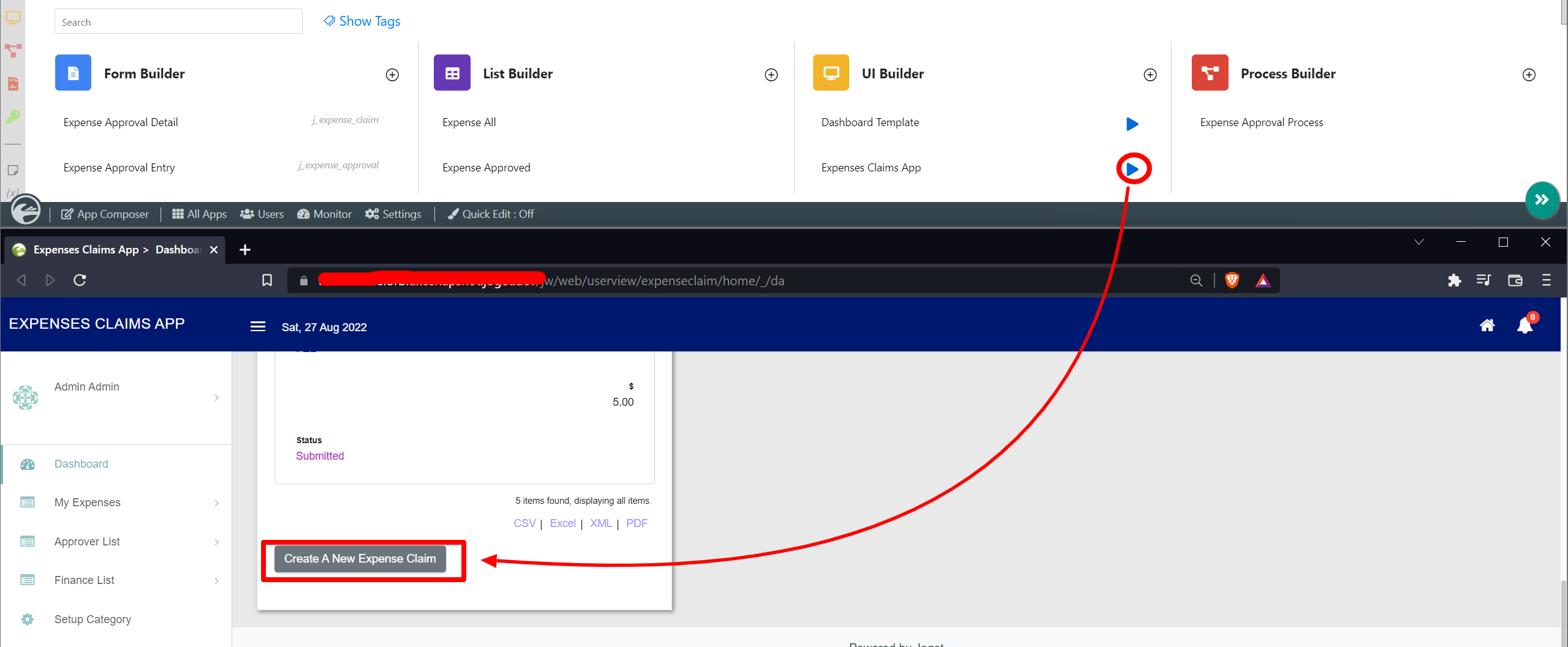
Figure 3 - Now we will need some data in order to display some values within the Popup SelectBoxSelect Box, head back to Design App and click the Launch button next to the Expenses Claims App.
- Click on Create a New Expense Claim button, fill up the necessary details and click on Continue Next Screen button (See Figure 4)
Figure 4 - Fill up the necessary details and click on the Complete button.
- Head back to the Popup Select Box in the Form Builder.
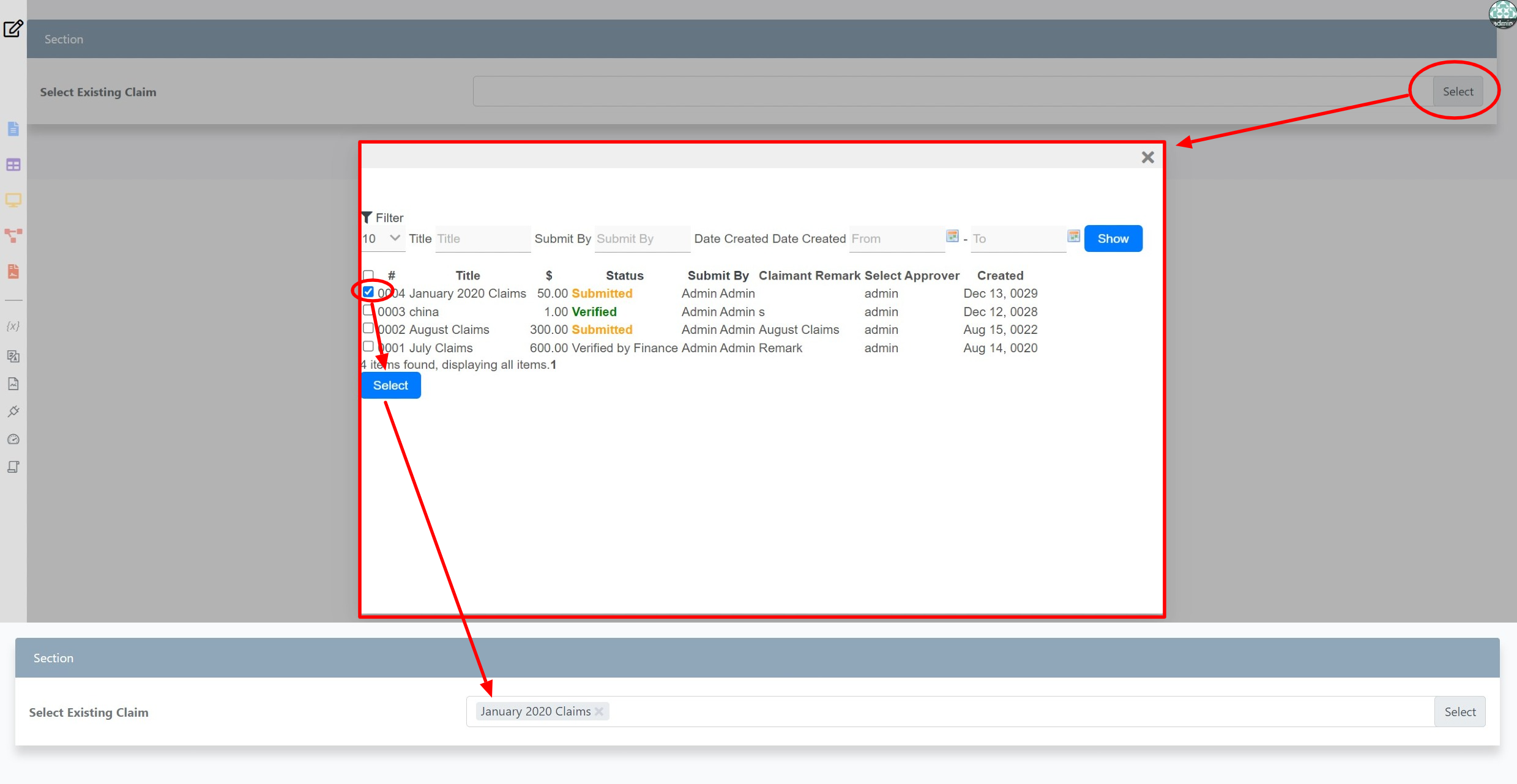
- Click on Preview and click on the Select button to display the popup DatalistList. Select one or more records and click on Select Button. The selected record title be displayed (see Figure 5).
Figure 5
...
| Name | Description | ||||||||
|---|---|---|---|---|---|---|---|---|---|
| Default Value | Default Value when there's no existing value found/selected. A hash variable is accepted here. For example, you may key the following
to pre-populate the field with currently logged in user's name. You may define multiple default options by separating them using semicolons.
| ||||||||
| ID Field | Target Data List's column ID value to be saved as the option value. Default: id | ||||||||
| Multiple Selection | Toggle Multiple Selection. | ||||||||
| URL Request Parameters for DatalistList | Refine the target Data List selections by defining the filter criteria here.
| ||||||||
| Validator | Attach a Validator plugin to validate the input value.
Available Options:
|
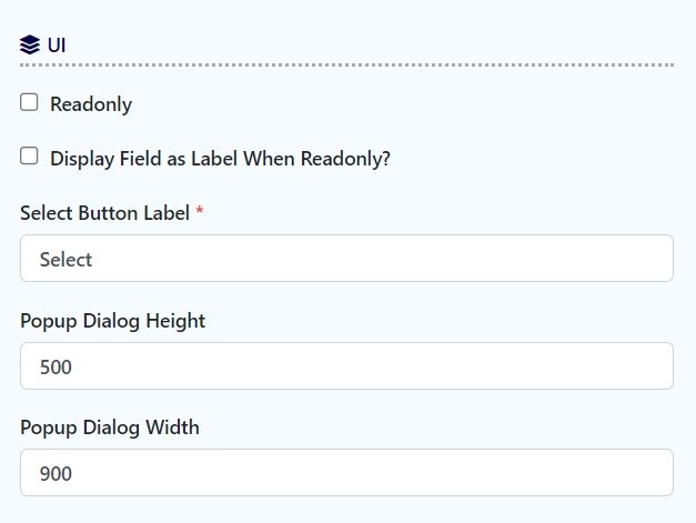
UI
| Name | Description | |||||
|---|---|---|---|---|---|---|
| Readonly | Determines if the element is editable. | |||||
| Display field as Label when readonly? | Displays the value of the element as plain text when element is set to "Readonly". | |||||
| Select Button Label | Select Button Label | |||||
| Popup Dialog Height | Height in character
| |||||
| Popup Dialog Width | Width in character
|
...

