Table of Contents
Introduction
| English |
|---|
| Date Picker extends the capability of a normal text field with a date picker library. |
Get Started
The easiest way to see how the Date Picker works is to use the existing built-in App Expenses Claims. Here are the steps:
- Start the Joget Server and open the App Center.
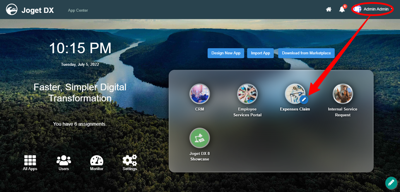
- Log in as admin and click on the pencil icon on the Expenses Claim to open the Design App Composer. (see Figure 1)
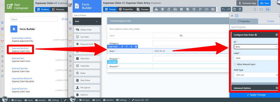
Figure 1 - Click on Expense Claim Entry and you will be directed to the Form Builder.
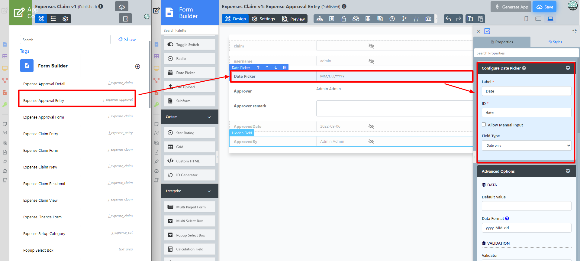
- Click on the Date Picker element on the canvas to open up the Date Picker properties. (see Figure 2)
Figure 2 - Click on Preview and click on the Date Picker to see it in action.
Date Picker Properties
...
Configure Date Picker
| Name | Description | |
| Label | Element Label to be displayed to the end-user. | |
| ID | Element ID (By declaring as "date", a corresponding database table column "c_date" will be created) Please see Form Element for more information about defining the ID and list of reserved IDs. Label | |
| Element Label to be displayed to the end-user. | Allow Manual Input | Rather than using the calendar picker, a user may key in the date directly if checked. |
| Field Type | New date picker property to define the field type as:
|
Advanced Options
Data
| Name | Description | |||||||||
|---|---|---|---|---|---|---|---|---|---|---|
| Default Value | Default Value when there's no existing value found/selected. The hash variable is accepted here. For example, you may key the following
| If "Date And Time" and "Time" field types are selected, this property will appear where you can select 12 or 24 Hours format. Checked for 24 Hours format. Unchecked for 12 Hours format. | ||||||||
| Data Format | The Data Format uses the Java date syntax. For example, the yyyy-MM-dd displays as 2019-10-23. |
Validation
| Name | Description | |||||
|---|---|---|---|---|---|---|
| Validator | Attach a Validator plugin to validate the input value. Please see Form Validator.
| |||||
| Start Date Field ID | This option should be used in conjunction with "Set Current Date As". | |||||
| End Date Field ID | This option should be used in conjunction with "Set Current Date As". | |||||
| Set Current Date As | Choices of:-
|
UI
| Name | Description | ||||||||||
|---|---|---|---|---|---|---|---|---|---|---|---|
| Placeholder | The placeholder attribute specifies a short hint that describes the expected value of an input field (e.g. a sample value or a short description of the expected format). The short hint is displayed in the input field before the user enters a value. | ||||||||||
| Display Format | The Display Format uses the jQuery date syntax. For example, the yy-M-dd displays as 2019-10-23. When this field is left empty, the following will be considered.
| ||||||||||
| Date Picker Year Range | Range of years to be shown In essence, the value left of the colon ":" must be a negative number and on the right must be a positive number. It indicates to Joget Workflow how many years earlier and how many years forward to display in the year select box based on the selected year. A value of "c-0:c+0" is also valid, this indicates to the user that he cannot change the year value (it will default to the current system year).
| ||||||||||
| Readonly | Determines if the element is editable. | ||||||||||
| Display field as Label when readonly? | Displays the value of the element as plain text when element is set to "Readonly". |
Workflow
| Name | Description | |||||||
|---|---|---|---|---|---|---|---|---|
| Workflow Variable | If the form is part of a workflow process, upon saving of the form (by clicking on "Save as Draft" or "Complete" button). The value in this input field will be saved into the corresponding workflow variable named here.
|
...


